I have now completed the pages for my magazine. Please find them attached below.

I have now completed the pages for my magazine. Please find them attached below.
Throughout the course of production, my magazine cover page has gone through many different stages of designs. At the start it was a very basic design and looked similar to the flat plan I had created in preproduction. Below I have added the different designs and then eventually the final design.
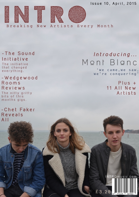
The first design was changed and edited to the second design once I had got some feed back from my teacher and also from members of my target audience. Here I changed around the layout of the cover lines and also added in extra content and features. One example of this is a unique selling point such as receiving a free EP. I also decided to change the font, sizes and colour of certain texts and reposition them on the page.
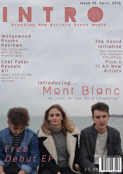
By the third design I had gathered more feedback again, and decided that I would change the background picture. I chose to do this due to the fact that I felt there was too much free empty space on the page, making it look empty. I have also decided to change the font colours again to fit in with the changing background and have also repositioned the text. I am now very happy with the way the page has turned out and believe that it looks very good and fits in well with the target audience genre and genre of the magazine.
I am now part way through the production of my pages, and I have now decided what images will be used on what pages, and the layouts of the pages. I have also begun to add text and other features onto the pages.
Below is my Cover Page so far. I have chose to use this picture as the background picture due to the fact that I feel that it fits in with the genre well. It also clearly represents the artists and how I want the magazine to look and follows the usual codes and conventions of magazines of this topic/area. I have chosen to go with this colour scheme as I feel that it will stand out on the news stand, and grab the audiences attention. It also helps add the modern and indie feel to the magazine which was what I wanted it to appear like from the start.

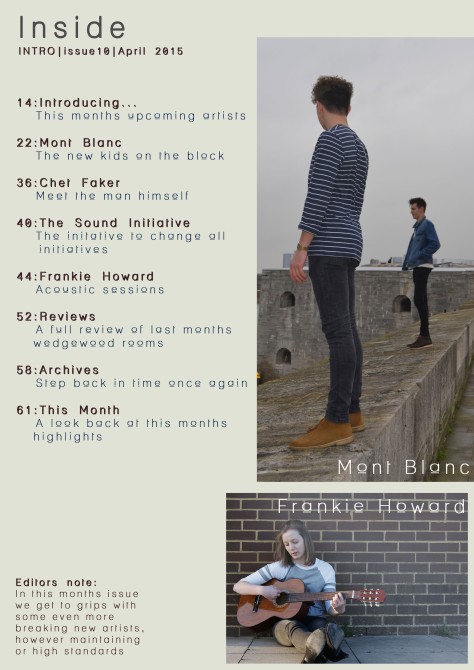
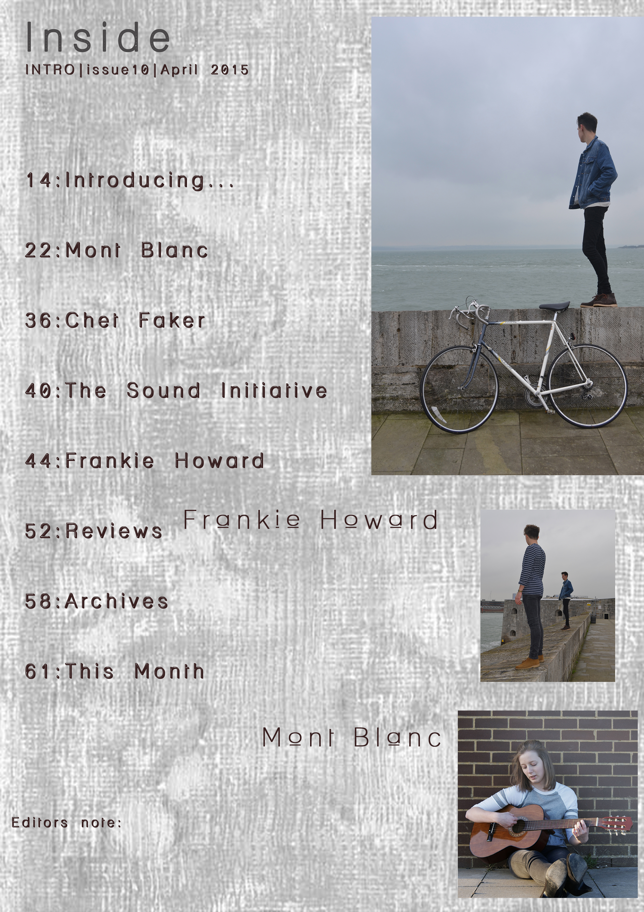
Here is an insert of my Contents page as it stands so far. I have chosen these fonts and this background for the page as I feel that it continues to add to the modern feel, but is also something different that you don’t normally see in magazines, therefore helping to increase the originality of the magazine and its themes.
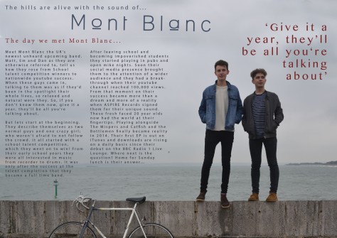
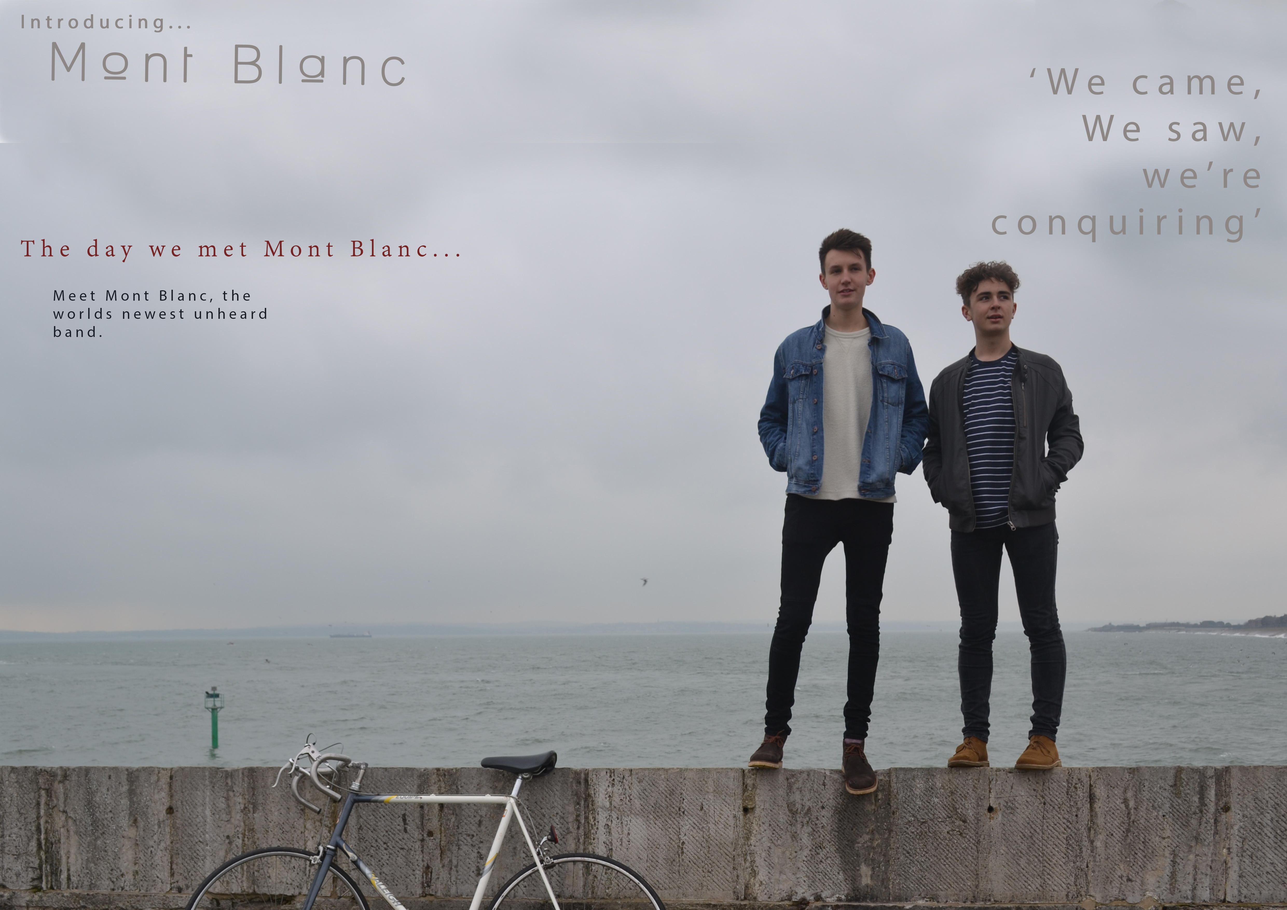
I have also inserted my Double Page spread as it is so far. I have chose to use this image as the back ground image as I feel that it clearly represents the artists and their themes and style of music. It shall also be easy to place text over where it shall be easily ligible.
I have now begun to produce the front cover for my magazine. Below you shall see a screen shot taken during production, showing the software that I am using and the fist initial looks of the cover page.
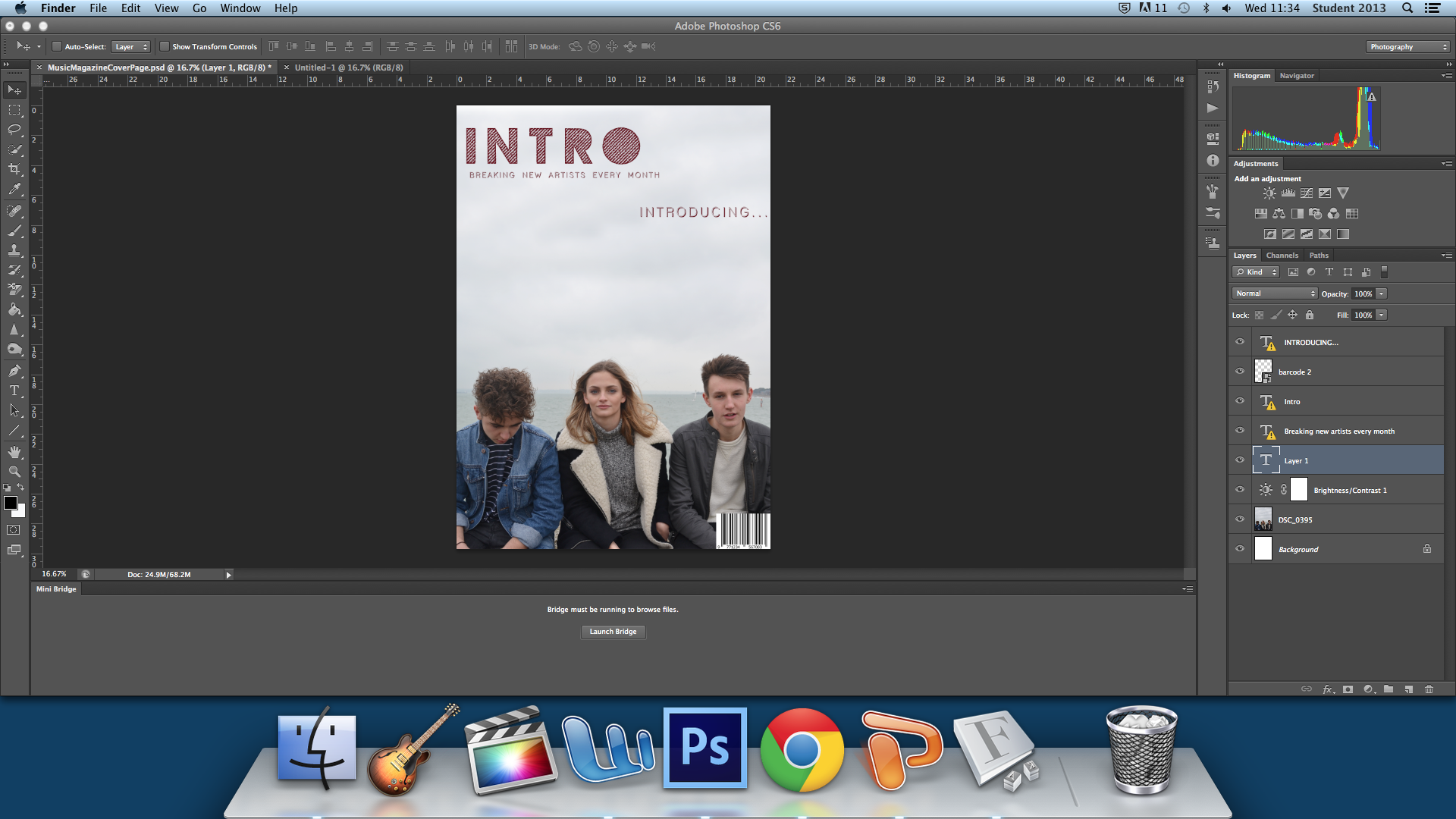
This is the progress of my cover page so far, I have now decided on the font that will be my title. This is shown below. 
I have chosen this font because I feel that it looks similar to the mesh on the front of an amp. This therefore will fit in with the theme of the music magazine and of small time artists that are breaking through via small gigs and playing in small time venues. It also adds an indie feel to the magazine and keeps it looking smart and fresh. I have chose the colour theme for the cover, with the tile being in a dark marron colour.
I have also decided the tag line for the magazine, and the font and colour that they will be.
![]()
I have chosen this because the magazine is about new break through artists, and this therefore clearly connotes that to the audiences.
I have now begun to produce my magazine pages, and have been out and taken my photos and have begun to plan the layout of the magazine.
I used a range of locations for my photo shoot, all in different areas around southsea, using various different backdrops and old buildings. I have chose to do this in order to help add to the indie feel and add to the rustic feel of the magazine and featured band.
Below I have also added my flat plans for how my pages shall look. However these are still subject to change throughout the production of the magazine.
Here I am going to review the double page spread of the music magazine Under the Radar. I have also reviewed the magazines contents page and cover page. The magazine is an indie music magazine that prints five issues a year, is distributed across North America and internationally. It therefore has a reasonable amount of content within each issue.

To start with I shall talk about the layout of the page. The fact that there is a large image situated on the left hand page and is encroaching on the right is extremely eye catching and will automatically grab the audiences attention if flicking through the magazine. It is bright and bold, it will add interest to the article and is clearly a group mid shot of the band which is featured in the article. However through doing this the page has left a lot of empty space, and could make the article feel empty. To combat this there is a range of different shapes such as rectangles dotted around the edges. This fits in with the style of the magazine making it feel indie and modern. It stops the feeling that there should be more on the page, and feels that actually it has a busy and smart look to the page. These shapes contrasting with the grainy worn look of the filter on the image, bringing the page back into the 21st century and adding a splash of bright colour to the page. Even though the image takes up the majority of the page, there still seems to be a large quantity of text within the article, helping to combat the feeling of a large amount of wasted space.
The colours and font used within the page and article are modern and the fonts are bold and sharp. The font used for the mast head of the page is the same font which the band use for their advertisement and promotion, therefore helping promote the band and promoting the feeling of independence and individuality. The majority of colours used is black and grey, however certain words or letters within the article are highlighted in a light blue font. This has been done to add colour and brightens up the overall colour of the page and also helps add a feeling of modernisation to the overall final product.
The text has been laid out in two vertical columns down the side of the page, this keeps the article easy to read and not seem such a daunting task with lots to read at once in one big block of text. A simple pull quote has also been used, which breaks up the article and helps to improve the aesthetics of the overall page.
The image used fits in well with the theme of the page, and must have been done in order to accurately represent the band and the genre and theme of their music and act. The colours are faded, with a filter clearly being added after the original shoot. The clothes and stances of the people in the shoot represent the genre and connote that they are an indie band which use guitars and have a grungy indie look.
Overall the magazine follows the usual codes and conventions of music magazine, and includes the usual features of magazine. Throughout the page , the feature has been presented in an aesthetically pleasing way, with the article appealing to the target audience.
This is my analysis of the contents page of the music magazine Under the Radar. It is an indie music magazine that prints five issues a year, is distributed across North America and internationally. It therefore has a reasonable amount of content within each issue.
To start with the layout of the page is very simplistic and clear. There is a modern and fresh feel which is present throughout the entire magazine. The articles and sub titles for each section of the magazine are clearly and evenly spaced out, however are at random intervals and not all set out in neat straight files. This helps add to the modern but indie look to the magazine.
The colour scheme of the page has also been kept very simple, with a plain white background being used, and black text over the top of it. However there are highlighted light blue words or boxes which help brighten up the page along side the images used on the page. This keeps up the modern look to the page, and continues to keep the magazine simple and smart looking. The contents lists are also laid out well, with all the different articles neatly laid out in simple vertical lists. The font has also been kept simple and sharp, so the page feels professional. However, the large page numbers used for each different sections or chapters of the magazine are in a different larger font, that allows the audience to be immediately drawn to them. This would therefore allow the readers to easily navigate the magazine and find what they are looking for.
The images used on the page are simple mid shots or close ups of what appears to be artists which are featured in the magazine. These images are neatly placed above each different chapters and clearly must have some importance to that area. They also reflect the genre of the magazine and incorporate the main codes and conventions of this type of genre of magazine.
Overall the contents page is sharp and fresh looking, which can easily appeal to the reader and neatly fits in with the genre of the magazine.
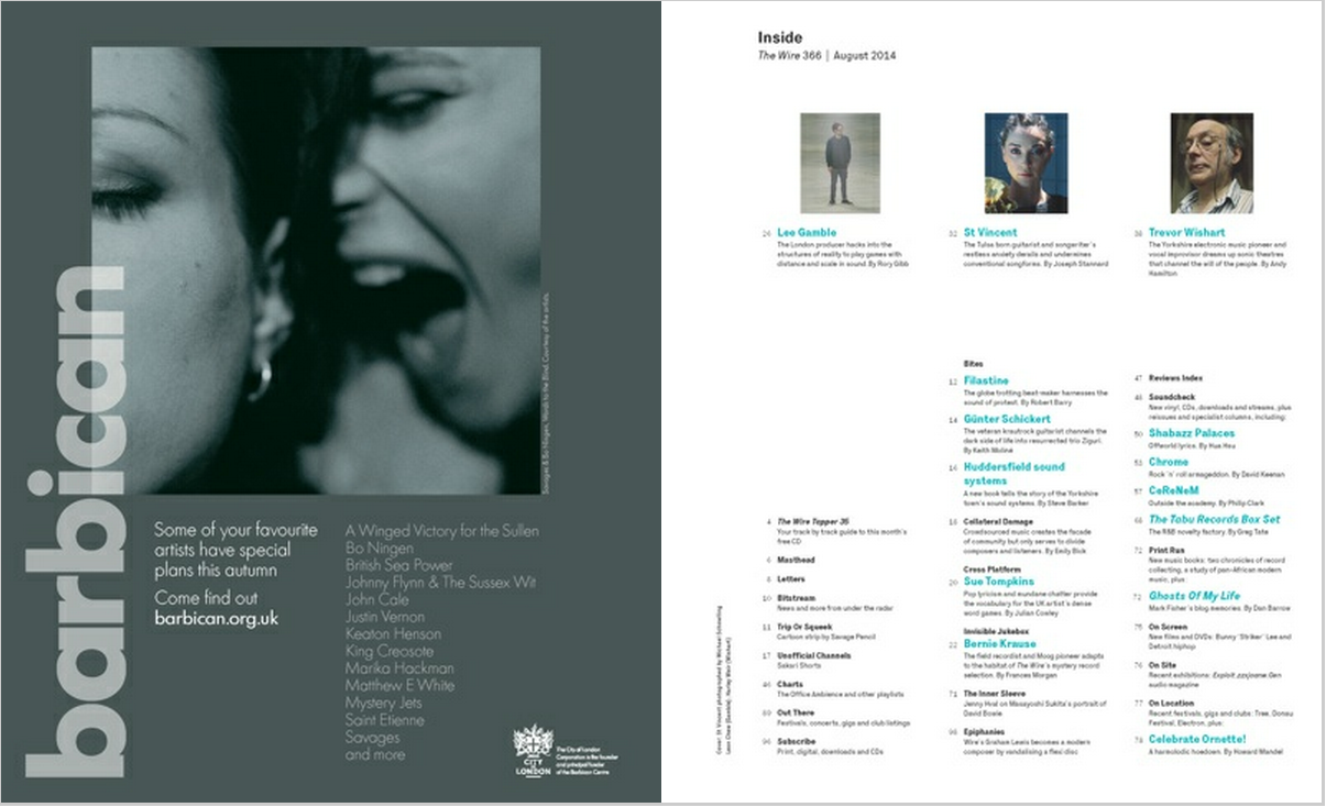
This is the contents page of the magazine The Wire. This magazine is a niche magazine that is aimed at indie music artists. The magazine follows an indie modern look that uses minimalistic designs to create a smart and fresh look. It uses a simple plain colour scheme, with a white back ground and black print colour. However the subheadings of each article has been coloured in a bright baby blue, that effectively coexists alongside the picture on the left hand side of the double page spread. Here on the left is what appears to be an advert. This advert is also very simple, and fits in with the rest of the magazine having a minimalistic theme and simple colour scheme. The whole look of the page follows te theme set by the cover, which is clearly done to aim the magazine at a specific target audience.
The font used is also simple, keeping an indie feel to the page. Here the use of the simple plain white background is complimented by the simple black colour of the font, with the occasional splash of bright blue livening it up. Also the use of different boldnesses of the font helps break up the page, and although it is mostly all bland colours, it still manages to intrigue and have a flash, fresh feel.
The magazine has decided to place only three pictures on the entire page, which follows the theme of being minimalistic and the idea of simplicity and out of the ordinary. The page has very little detail about the articles featured as well, with only two lines for most about each article. The main articles are the only ones with the pictures above.
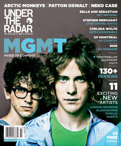
This is my analysis of a cover page for the music magazine ‘Under the Radar’. This is an indie music magazine that prints five issues a year, is distributed across North America and internationally. It offers intelligent, and sometimes humorous, articles that go far beyond a band’s major influences, often accompanied by exclusive photo shoots. The tastemaking publication strives to be ahead of the curve, interviewing exciting young artists months or years before the mainstream media catches on.
The colour scheme of the cover fits in with the outfits of the artists, with their clothing corresponding with the colour of their eyes. the cover uses a simple close up of the two artists face, which clearly identifies the man at the front as the face man for band. A plain and bland background has been used which keeps the cover looking simple and helps to add to the modern and simple look. The colour scheme creates a calm and natural environment, which adds to the genre of the magazine as being indie and new. The magazine follows the usual codes and conventions of music magazines, with a simple shot of the featured artists of the issue, and the usual title situated in the top right hand corner of the cover.
The title has its own individual theme for the magazine with their own new design and the magazines sell line underneath. This would allow the audience to be able to recognise the magazine whatever the cover looks like due to the continually of the title block and layout. The cover also boasts that there is 33 free songs within. This is a way that the magazine could increase sales and advertise new artists that they have featured and spread their music around. The cover also has short and snappy strap lines along the top of the cover also help keep the cover looking simple and smart. They advertise the artists that are featured in the issue. This is a good way of helpin sell the magazine,because anyone interested in these artists may see the cover, and therefore want to buy the magazine for that artists interview.
The lead articles cover line has been placed under the title and blown u in size compared with all the other cover lines. This therefore makes it obvious that this is the main feature of the magazine, and that they believe that it will help the magazine sell. This could be due to the fact that it is just simply the artists name, and will add suspense to what it is about. The colour of the font through out the cover fits in well with the colour scheme, with blue and white being the main colours used. The cover lines are also kept short and snappy and help to keep the cover minimalistic and indie looking, helping make it look modern and smart.
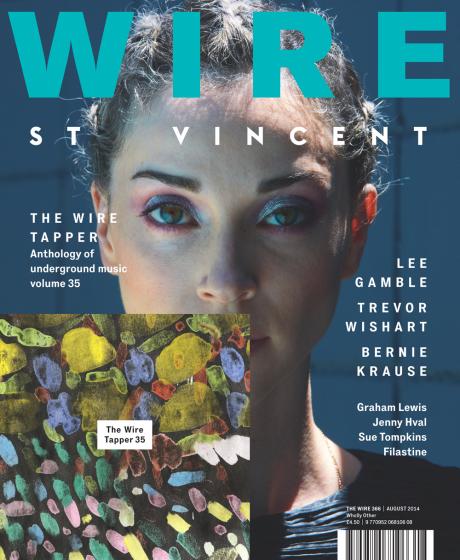 This is the Wire Magazine front cover. The Wire is an independent, monthly music magazine covering a wide range of alternative, underground and non-mainstream musics. The Wire celebrates and interrogates the most visionary and inspiring, subversive and radical, marginalised and undervalued musicians on the planet, past and present, in the realms of avant rock, electronica, hiphop, new jazz, modern composition, traditional musics and beyond. Passionate, intelligent and provocative, The Wire wages war on the mundane and the mediocre. The font that has been used is simple and minimalistic with a modern feel to it. I think that this has been done in order to go with the magazine feel and design of being a modern and new-indie style magazine. It makes it look simple , adding an aspect of calmness and coolness to the cover. It helps it fit in with the target market and appeal to the target audience. The way that the spacing in the font is such a big gap, adds to the minimalistic look of the cover, however makes it look like there is more on the cover then there really is. I like the way that this has been done because it keeps the cover looking smart and simple, but doing something new and bold. The title has been placed at the top center, in a large bold font in order to grab the audiences attention and fits with the theme and layout of every other issue of the publication. By doing this they have made sure that their magazine has a brand identity and is known when seen on the shelf. The colour is a light, soft turquoise blue that could be used to connotate that the magazines genre is calm and relaxing, possibly an alternative genre. Underneath the title is an artist’s name, which could also be taken for as a tag line, doing something new that has not been done before. The cover consist of one individual picture, which is of an artist. The background is of what appears to be some kind of wall of some sort, with the artist wearing a blue top. This also follows the colour scheme for the cover, giving it a soft cool look, and follows the brand identity as all covers are the same with a close up of the featured artists face. Attached to the cover is the magazines latest free to readers CD. It contains 20 tracks that are featured in the past issues of the magazine, and artists that are covered by them. This has been done in order to attract readers in and make them want to buy the issue. It can be done as a marketing campaign to increase sales.
