
All posts by risswright
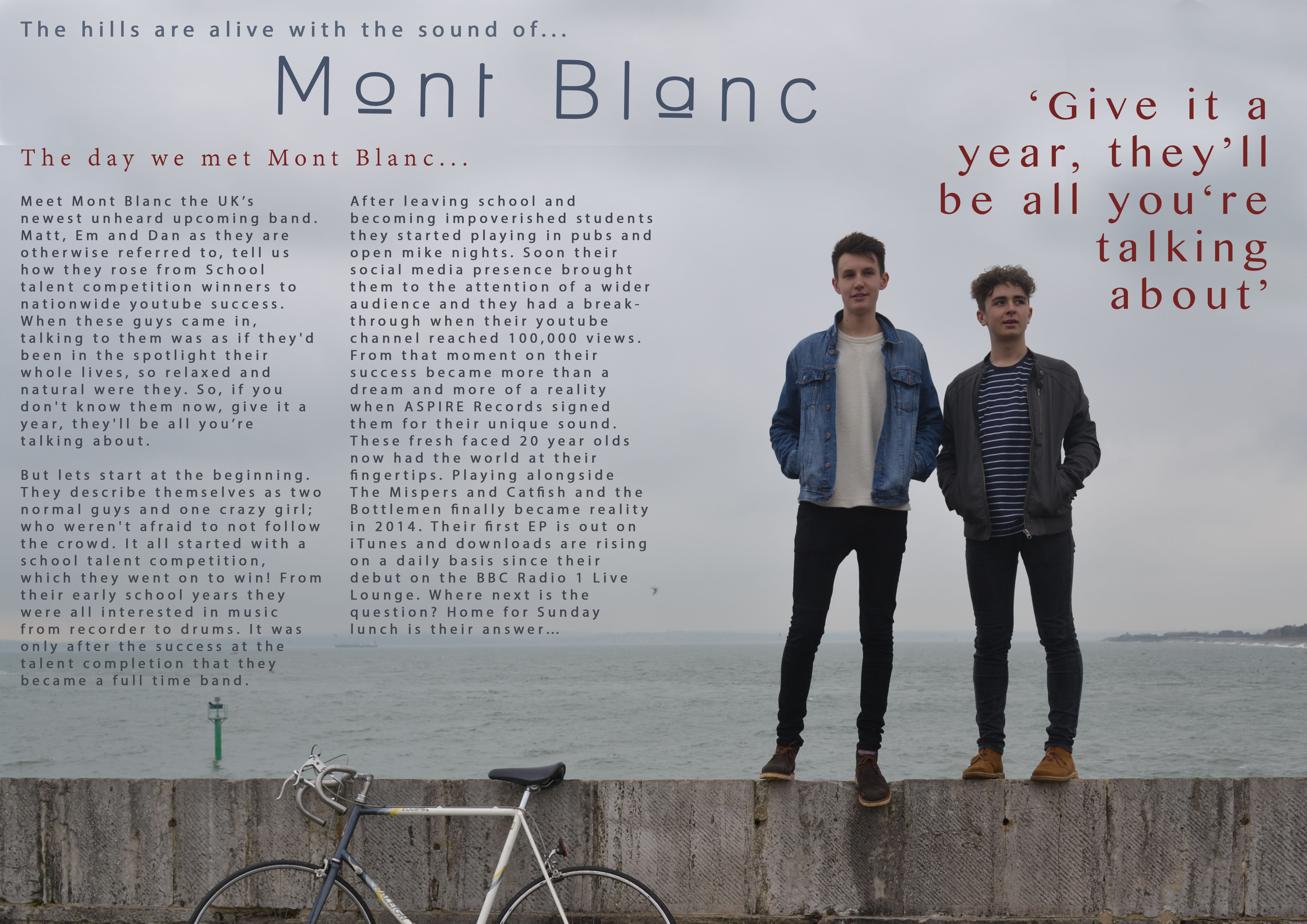
INTRO Magazine Contents Page

INTRO Magazine Double Page Spread
Evaluation – 1. In what ways does your media product use, develop or challenge forms and conventions of real media products?
This is my answer to question 1 of the evaluation questions for my magazine coursework.

Above is two images of mastheads, the top one is from my magazine INTRO and the other is from a popular niche magazine published by bauer media called KERRANG!
My masthead for INTRO has been kept very simple and smart looking, with a sell line neatly placed underneath and slightly of centre to the right of the masthead. Above I have decided to place the issue number and date of the issue. The fonts I have used are modern and smart, With the font for the masthead being used to represent the cover on an amplifier, this therefore helps it fit in neatly with the genre of the magazine and connotes the idea of music and sound.
The masthead on Kerrang! magazine is a similar font to mine, with a bold and large black font being used. There are white lines slashed across the font, which connotes the impression that it is like glass, and the sound and volume of the music is smashing it. This helps represent the genre of the magazine and the demeanour of people who listen to it. Above there has been numerous tag and sell lines along the top of the masthead in the form of a banner. This helps sell the magazine but can also give the impression that it is cheap and tacky.
Above is an extract of my magazines front cover and Kerrang! magazines front cover. Both covers use the usual codes and conventions of magazines, however they are both laid out and presented differently. My magazine follows its genre and themes of indie and being smart and modern, however the kerrang cover is crammed and is very loud and bold. They both however feature cover lines and have a main image in the centre of the page. The coverline are laid out in the same format, and the image fills the whole of the page. Therefore even though they are two very different types of magazines and genres, they still both fit in with the usual codes and conventions of magazine and would both be able to stand out for different reasons on a news stand.
Evaluation – 2. How does your media product represent particular social groups?
Here is my answer to question 2 of the evaluation.
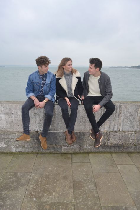

Above I have placed two images of the band that I have featured in my magazine. They are called Mont Blanc and are an indie rock band who have just had their big break through.
I chose to represent my artists as an indie group who and rebellious and independent. I therefore chose them to wear non mainstream clothing, however they needed to look stylish and cool. I also chose them to adopt stances that showed off there differences and and to make them to be relatable to the target audience. However, I also wanted them to look like normal people and therefore be able to show that they are just normal people who had a chance and made something of themselves.

Above I have inserted the cover to the magazine Q. Here they have chosen to represent their artists very differently to mine. They are represented as with their front man as the leader, almost as though they are not equal, with him being the leader. They are however also styled as an indie group who do not follow the usual forms and conventions or modern day fashion. They are part of a smaller group which dont follow modern mainstream fashion. Due to this both magazines use a similar social groups in their magazine and therefore must also be aiming at the same target audience.
Evaluation – 3. What kind of media institution might distribute your media product and why?
![]()
I have chosen to use the ‘Bauer Media’ to promote and distribute my magazine. Bauer media is is the UK based division of the Bauer Media Group company based in Hamburg, Germany. The company is Europe’s largest privately own media publishing company and publishes over 300 magazines in 15 countries. The company distributes magazine internationally over several different countries, and includes TV and Radio ownership. It publishes a range of different magazines, from top mainstream magazines such as Empire and Q magazine, to niche market magazines such as Kerrang! and Steam Railway.
I feel that this would be a great company to distribute my magazine as it has lots of experience in niche magazines and would therefore be able to profit my magazine and profit from the publication of it. The company would be able to promote and advertise my magazine worldwide across a range of different media platforms, such as TV, Radio and the internet. The company also has the correct resources in order to allow the magazine to expand and move onto different media platforms themselves. This would be things such as a digital edition on the internet, or a downloadable digital edition for devices such as smart phones and iPads. They would also be able to expand and produce an app for the magazine and possibly even a local radio station. These could be needed to help increase the profits from the magazine, this could be due to the fact that now due to recent technological improvements, the sales of magazine publications has dropped dramatically. Therefore they will need to find other ways in which they can profit from the publication. Bauer Media has the resources and budget in order to be able to do this successfully.
The demographics for my magazine are both ABC1 and C2DE however it is aimed more at people that are into finding more about new artists and are passionate about music. Therefore the magazine will draw readers from both demographic groups, due to the fact wether you like and are passionate about music is not dependant n your class. The magazine also has a reasonable price range so it can also be bought by both groups, I feel as though Bauer would benefit greatly from publishing this magazine as it would bring them in a whole new load of readers and build them a greater readership and overall increase their profits.
Kerrang! magazine is an example of a magazine already produced by Bauer. It is a niche magazine that is about heavy metal rock music, and has been published for many years with a new issue being produced every week. There is an app for the magazine and also has its own TV and radio shows. This therefore helps greatly increase the profitability of the magazine and benefits the Bauer Media Group greatly. I feel that if Bauer media took on publication of my magazine they could take it the same way that they did with Kerrang! and it could end up becoming an extremely profitable publication.
Evaluation – 4. Who would be the audience for your media product?
Below I have placed screenshots from a Facebook profile home page of a typical target audience member for my magazine.


I have chose to represent him in this way because I feel that this would be what a typical audience members lifestyle would be like for my magazine. He is meant to be represented as a rebellious and indie personality with a new indie style of fashion and taste in music.
Evaluation – 5. How did you attract/address your audience?
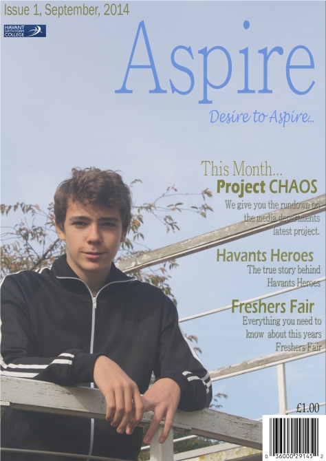
Below I have placed my magazine front cover. In my magazine I have used a range of different techniques in order to attract my target audience and to address them.
I have used many different techniques in order to appeal to the target audience. One example of this is the use of a large bold masthead, which is in a bright colour and bold font in order to stand out and grab the readers attention. I also decided to use a bright and intriguing background image in order to intrigue the readers and make them want to find out more about the images and who it is that is featured in the image. A range of colours was also used, with mainly bright, colourful contrasting colours used on the font to help it stand out from the crowd.
Below I have embedded a clip of an interview with a member of the target audience asking them for their opinions on my cover page, and asking them what stood out to them and intrigued them as a member of the target audience.
Evaluation – 6. What have you learnt about technologies from the process of constructing this product?
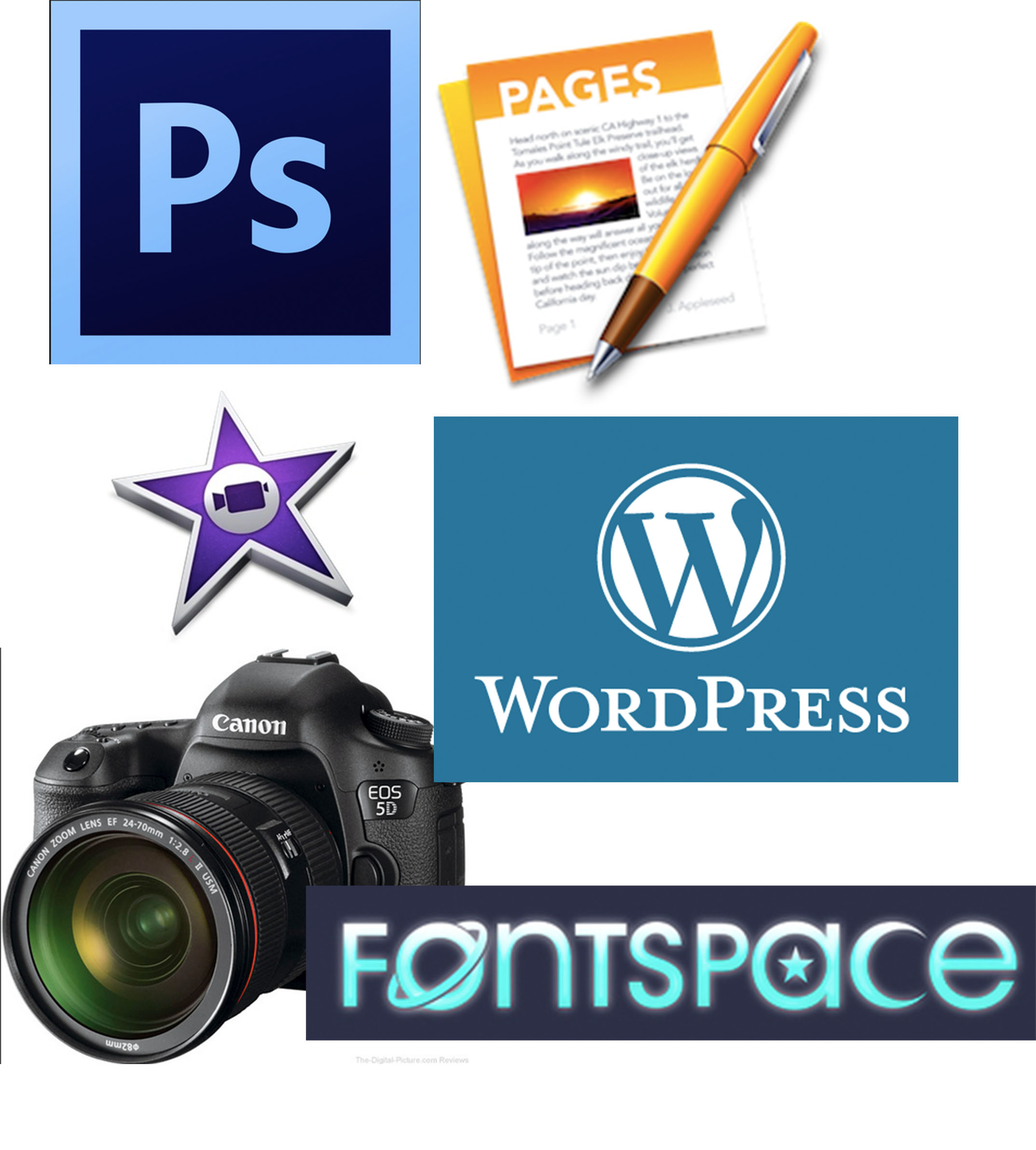
Above I have placed an image of different technologies that I have used during the production of my magazine. Throughout production I needed to use a range of different products in order to complete such a effect magazine. Below I have comprised a list of what I used…
- WordPress – I used this website to produce my blog on which I am talking to you now. I had to learn the basics of how to upload and layout a blog, and also how to import images and upload my magazine pages.
- Photoshop – I used this photo editing software to edit my photos and create my magazine front cover. Here I had to watch a range of youtube videos and read forums in order to learn how to use the software. Overall I have learned many new things about the software and how it works.
- DSLR Camera – I had to learn how to use the camera to take the shots that were needed for my magazines. I needed to learn how to manipulate the camera and use the different features built in to get the best shots possible.
- iMovie – Here I had to learn how to use Apples iMovie software to create the answers to some of my evaluation questions, such as the audience members thoughts on my Cover Page and designs.
- Fontspace – This is a website where you can find new and interesting font online that you can download and use in your magazine or on a normal pages or word document. I used this website to help me throughout product to use different fonts on the magazine.
- Apple Pages – I used Apples pages software to write my double page spread on and to plan my answers to the evaluation. Here I already new how to use the software due to the fact that I use it often for my college work at home , and it is very similar to Microsoft Word.
Evaluation – 7. Looking back at your preliminary task, what do you feel you have learnt in the progression from it to full product?

Above I have placed images of my Preliminary task and my Final task front covers.
Through out the production of my two magazine covers, I have learnt many new different things about the softwares used for the production of magazines. I also believe that this shows through my two different covers and the difference between the two. I feel as though I have come a long way from when I first started the course to now when I am finally finishing the course.
I have learnt many new things during the production of the pages. My photoshop skills improved dramatically from the start of the production. I had to look on you tube, and watch numerous videos on how to perform certain tasks and edit images in certain ways on photoshop. My attention to detail also increased during production, this could be due to my photoshop skills slowly improving, and my plans for the magazine finally taking shape and improving.
One feature that I have dramatically changed between the preliminary and this task is the use of space on the cover. As you can see on the preliminary task I left a lot of space on the cover, and the majority of the page was the main image, with empty spaces left making the cover look bare and empty. However, after conducting vast amounts of research for the main task, I discovered the problem, and realise that actually magazine have barely any space left empty on the pages, and the majority of times, text is left overlapping the main image. Therefore when it came to producing the cover page for the main task I realised that I needed to use space a lot more effectively than I had done in the preliminary. Therefore I dramatically increased the amount of cover lines on the page, and also included other features onto the page.
After extensive research I also concluded that I needed to include something on the page that stood out and grabbed the audiences attention. I soon realised that this was something that I had fail to do on the preliminary task, and needed to include on the main task. I therefore decided that I would increase the size and boldness of the masthead, also making it a bright more contrasting colour.
Due to these improvements and changes, I feel as though I have learnt a great deal since when I first started the course. My photoshop and camera skills have greatly improved through the course, and I feel that if I was going to repeat the task again, I would be able to improve and advance them even further.
