Throughout the course of production, my magazine cover page has gone through many different stages of designs. At the start it was a very basic design and looked similar to the flat plan I had created in preproduction. Below I have added the different designs and then eventually the final design.
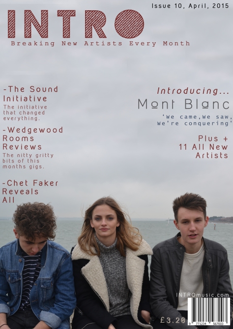

The first design was changed and edited to the second design once I had got some feed back from my teacher and also from members of my target audience. Here I changed around the layout of the cover lines and also added in extra content and features. One example of this is a unique selling point such as receiving a free EP. I also decided to change the font, sizes and colour of certain texts and reposition them on the page.
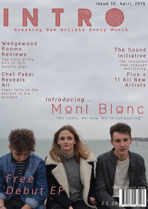
By the third design I had gathered more feedback again, and decided that I would change the background picture. I chose to do this due to the fact that I felt there was too much free empty space on the page, making it look empty. I have also decided to change the font colours again to fit in with the changing background and have also repositioned the text. I am now very happy with the way the page has turned out and believe that it looks very good and fits in well with the target audience genre and genre of the magazine.
