I am now part way through the production of my pages, and I have now decided what images will be used on what pages, and the layouts of the pages. I have also begun to add text and other features onto the pages.
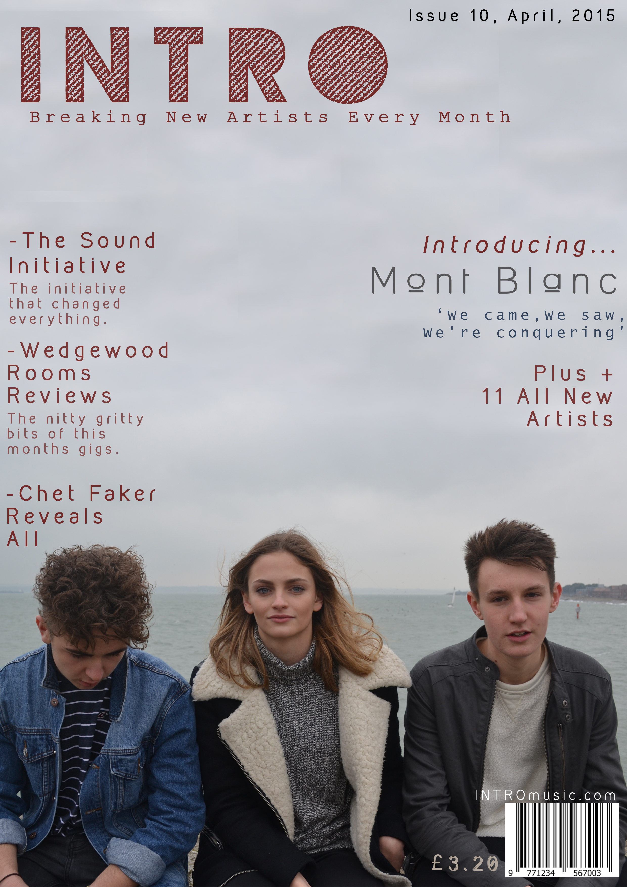
Below is my Cover Page so far. I have chose to use this picture as the background picture due to the fact that I feel that it fits in with the genre well. It also clearly represents the artists and how I want the magazine to look and follows the usual codes and conventions of magazines of this topic/area. I have chosen to go with this colour scheme as I feel that it will stand out on the news stand, and grab the audiences attention. It also helps add the modern and indie feel to the magazine which was what I wanted it to appear like from the start.
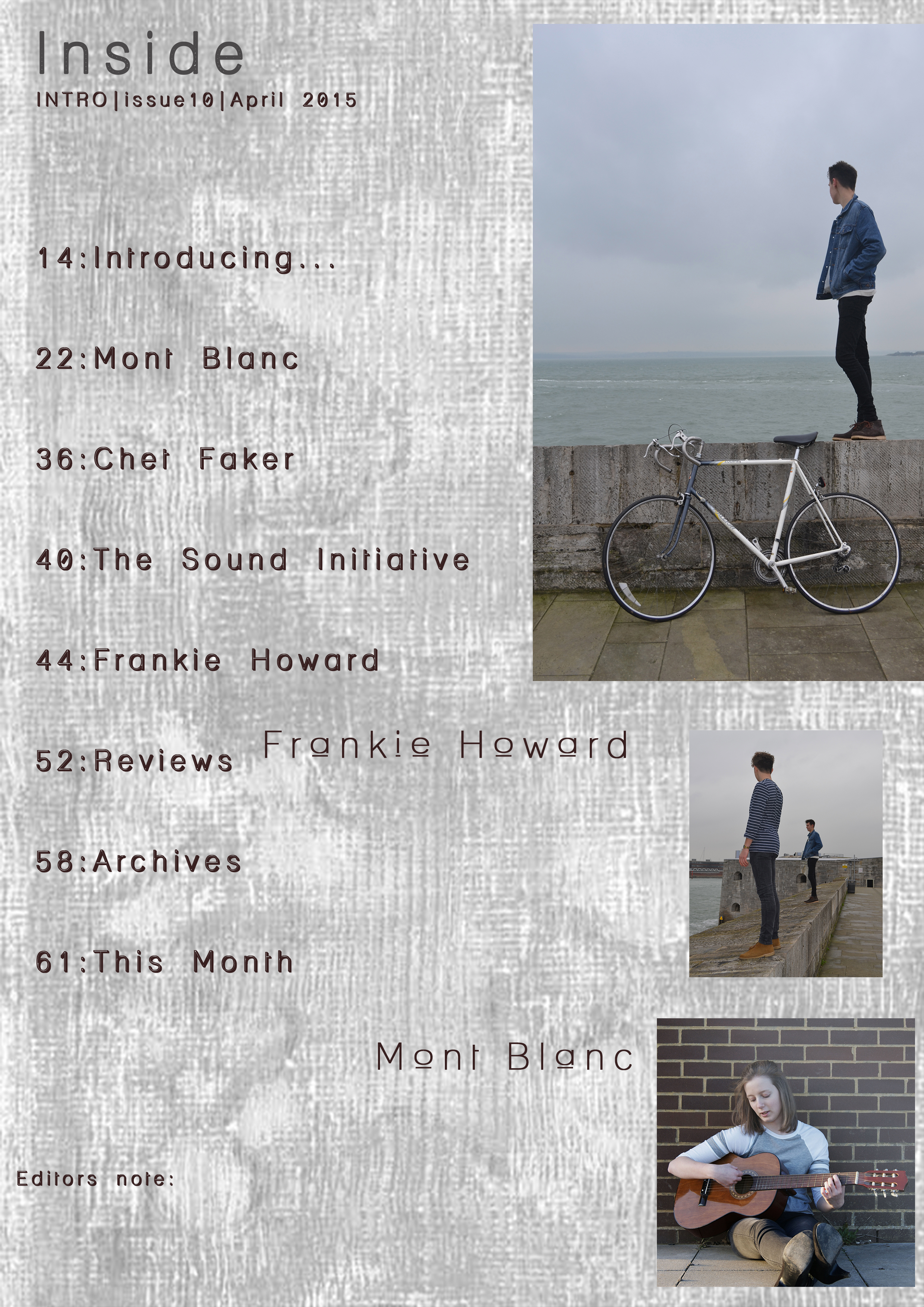
Here is an insert of my Contents page as it stands so far. I have chosen these fonts and this background for the page as I feel that it continues to add to the modern feel, but is also something different that you don’t normally see in magazines, therefore helping to increase the originality of the magazine and its themes.
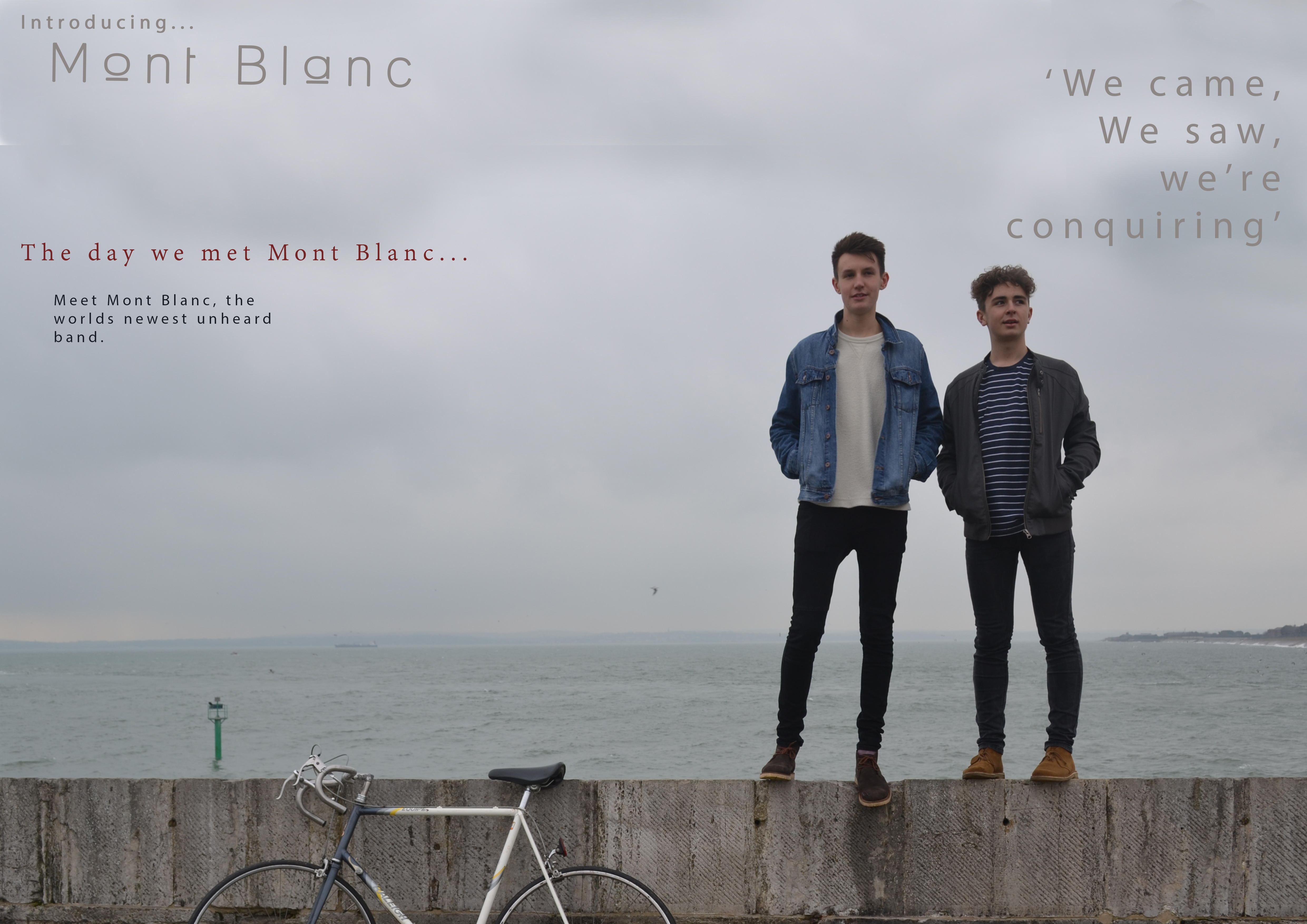
I have also inserted my Double Page spread as it is so far. I have chose to use this image as the back ground image as I feel that it clearly represents the artists and their themes and style of music. It shall also be easy to place text over where it shall be easily ligible.