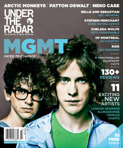
This is my analysis of a cover page for the music magazine ‘Under the Radar’. This is an indie music magazine that prints five issues a year, is distributed across North America and internationally. It offers intelligent, and sometimes humorous, articles that go far beyond a band’s major influences, often accompanied by exclusive photo shoots. The tastemaking publication strives to be ahead of the curve, interviewing exciting young artists months or years before the mainstream media catches on.
The colour scheme of the cover fits in with the outfits of the artists, with their clothing corresponding with the colour of their eyes. the cover uses a simple close up of the two artists face, which clearly identifies the man at the front as the face man for band. A plain and bland background has been used which keeps the cover looking simple and helps to add to the modern and simple look. The colour scheme creates a calm and natural environment, which adds to the genre of the magazine as being indie and new. The magazine follows the usual codes and conventions of music magazines, with a simple shot of the featured artists of the issue, and the usual title situated in the top right hand corner of the cover.
The title has its own individual theme for the magazine with their own new design and the magazines sell line underneath. This would allow the audience to be able to recognise the magazine whatever the cover looks like due to the continually of the title block and layout. The cover also boasts that there is 33 free songs within. This is a way that the magazine could increase sales and advertise new artists that they have featured and spread their music around. The cover also has short and snappy strap lines along the top of the cover also help keep the cover looking simple and smart. They advertise the artists that are featured in the issue. This is a good way of helpin sell the magazine,because anyone interested in these artists may see the cover, and therefore want to buy the magazine for that artists interview.
The lead articles cover line has been placed under the title and blown u in size compared with all the other cover lines. This therefore makes it obvious that this is the main feature of the magazine, and that they believe that it will help the magazine sell. This could be due to the fact that it is just simply the artists name, and will add suspense to what it is about. The colour of the font through out the cover fits in well with the colour scheme, with blue and white being the main colours used. The cover lines are also kept short and snappy and help to keep the cover minimalistic and indie looking, helping make it look modern and smart.
