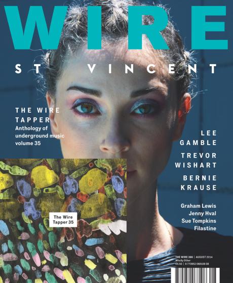
 This is the Wire Magazine front cover. The Wire is an independent, monthly music magazine covering a wide range of alternative, underground and non-mainstream musics. The Wire celebrates and interrogates the most visionary and inspiring, subversive and radical, marginalised and undervalued musicians on the planet, past and present, in the realms of avant rock, electronica, hiphop, new jazz, modern composition, traditional musics and beyond. Passionate, intelligent and provocative, The Wire wages war on the mundane and the mediocre. The font that has been used is simple and minimalistic with a modern feel to it. I think that this has been done in order to go with the magazine feel and design of being a modern and new-indie style magazine. It makes it look simple , adding an aspect of calmness and coolness to the cover. It helps it fit in with the target market and appeal to the target audience. The way that the spacing in the font is such a big gap, adds to the minimalistic look of the cover, however makes it look like there is more on the cover then there really is. I like the way that this has been done because it keeps the cover looking smart and simple, but doing something new and bold. The title has been placed at the top center, in a large bold font in order to grab the audiences attention and fits with the theme and layout of every other issue of the publication. By doing this they have made sure that their magazine has a brand identity and is known when seen on the shelf. The colour is a light, soft turquoise blue that could be used to connotate that the magazines genre is calm and relaxing, possibly an alternative genre. Underneath the title is an artist’s name, which could also be taken for as a tag line, doing something new that has not been done before. The cover consist of one individual picture, which is of an artist. The background is of what appears to be some kind of wall of some sort, with the artist wearing a blue top. This also follows the colour scheme for the cover, giving it a soft cool look, and follows the brand identity as all covers are the same with a close up of the featured artists face. Attached to the cover is the magazines latest free to readers CD. It contains 20 tracks that are featured in the past issues of the magazine, and artists that are covered by them. This has been done in order to attract readers in and make them want to buy the issue. It can be done as a marketing campaign to increase sales.
- Comment
- Reblog
-
Subscribe
Subscribed
Already have a WordPress.com account? Log in now.
